- An Introduction to Machine Learning | The Complete Guide
- Data Preprocessing for Machine Learning | Apply All the Steps in Python
- Regression
- Learn Simple Linear Regression in the Hard Way(with Python Code)
- Multiple Linear Regression in Python (The Ultimate Guide)
- Polynomial Regression in Two Minutes (with Python Code)
- Support Vector Regression Made Easy(with Python Code)
- Decision Tree Regression Made Easy (with Python Code)
- Random Forest Regression in 4 Steps(with Python Code)
- 4 Best Metrics for Evaluating Regression Model Performance
- Classification
- A Beginners Guide to Logistic Regression(with Example Python Code)
- K-Nearest Neighbor in 4 Steps(Code with Python & R)
- Support Vector Machine(SVM) Made Easy with Python
- Kernel SVM for Dummies(with Python Code)
- Naive Bayes Classification Just in 3 Steps(with Python Code)
- Decision Tree Classification for Dummies(with Python Code)
- Random forest Classification
- Evaluating Classification Model performance
- A Simple Explanation of K-means Clustering in Python
- Hierarchical Clustering
- Association Rule Learning | Apriori
- Eclat Intuition
- Reinforcement Learning in Machine Learning
- Upper Confidence Bound (UCB) Algorithm: Solving the Multi-Armed Bandit Problem
- Thompson Sampling Intuition
- Artificial Neural Networks
- Natural Language Processing
- Deep Learning
- Principal Component Analysis
- Linear Discriminant Analysis (LDA)
- Kernel PCA
- Model Selection & Boosting
- K-fold Cross Validation in Python | Master this State of the Art Model Evaluation Technique
- XGBoost
- Convolution Neural Network
- Dimensionality Reduction
Evaluating Classification Model performance | Machine Learning
Through this post, you are going to understand different metrics for the evaluation of classification models.
The Basics: False Positive and False Negative
Suppose your classification model predicts the probability of a person having cancer based on various features. Here the outcome is binary, either Yes or No. That means the person has cancer or not. That's simple. Well, as your model is not absolutely correct every time (it doesn't provide 100% accuracy), it will misjudge some events and thus provide the wrong outcome. If your model predicts that the person has cancer but in reality, he doesn't, then the outcome is a False Positive or Type I error. On the other hand, if the person does have cancer, but your model predicts No, then that is a False Negative or Type II error.
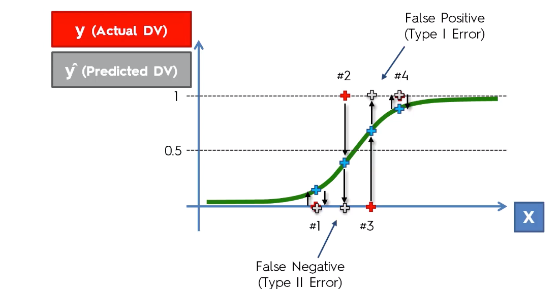
Here the red points are the actual outcomes and the grey points are predicted outcomes. False-positive errors are less impactful so as False Negative errors. For example, if the model predicts the person doesn't have cancer while he actually has will have more impact than the prediction that tells the person has cancer but in reality does not.
Confusion Matrix:
Confusion Matrix is the most commonly used metric for evaluating the performance of a classification model. It shows the number of correct and incorrect predictions made by a model compared to the actual outcomes(target value). It is an NxN matrix, where N is the number of target classes. i.e. the number of labels for predictions. It shows the number of False Positive(FP) and False Negative(FN) in the NxN grid.
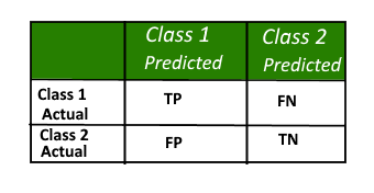
Here
TP = True Positive, the actual and predicted outcomes are both positive
FP = False Positive, the predicted outcome is true but the target value is false
TN = True Negative, the actual and predicted outcome are both negative
FN = False Negative, the predicted outcome is negative but the target value is positive
Using the confusion matrix, we can calculate the accuracy rate of our models. Let's take an example.
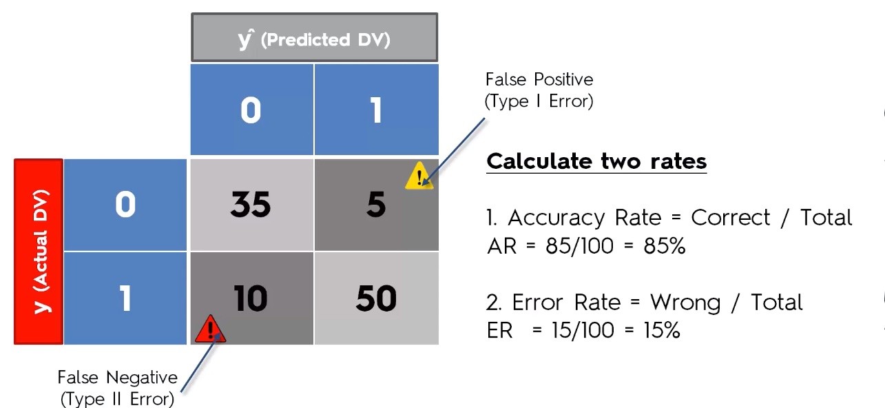
Accuracy Paradox
The confusion matrix may lead to the wrong evaluation of models. This is known as the accuracy paradox. It happens when you stop your model to predict logically, which means you stop the model to learn. For example, let's say we have a model with the following confusion matrix.
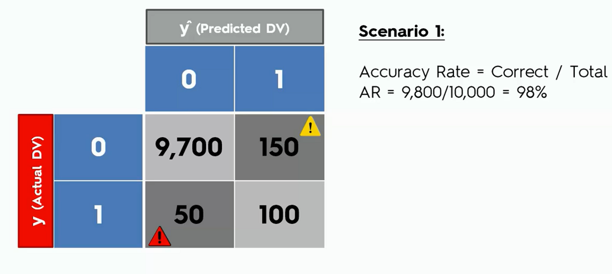
Let's say from now on we ask our model to predict only a false outcome that is a zero in the confusion matrix. Now see how the accuracy look like.
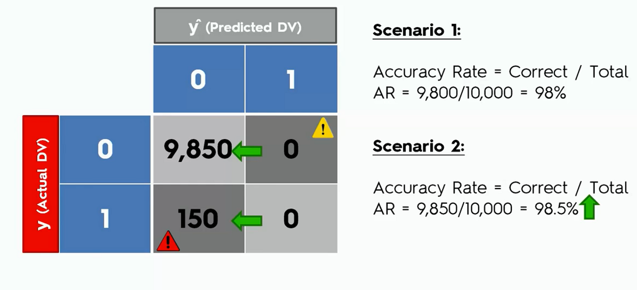
In the second case, we can see that the accuracy of the model went up though the model was not actually doing any logical predictions.
Though easy to understand but Confusion matrix is not a good metric for model evaluation.
Cumulative Accuracy Profile(CAP) Curve
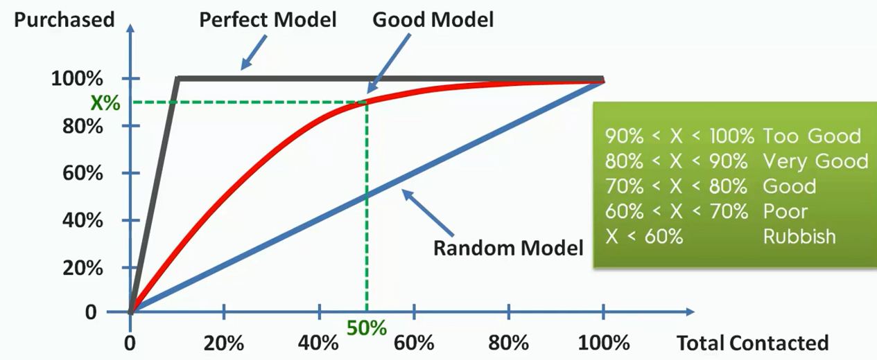
The cumulative accuracy profile (CAP) is used in data science to visualize the discriminative power of a model. The CAP of a model represents the cumulative number of positive outcomes along the y-axis versus the corresponding cumulative number of a classifying parameter along the x-axis. The CAP is distinct from the receiver operating characteristic(ROC), which plots the true-positive rate against the false-positive rate.
Let's take an example say we are contacting customers to sell some products. And we know that among our customers, 10% of them will buy our product. Now, if we build a model that helps us to classify which of the customers will respond to us if conducted.
Now how could we say that ours one is a good model?
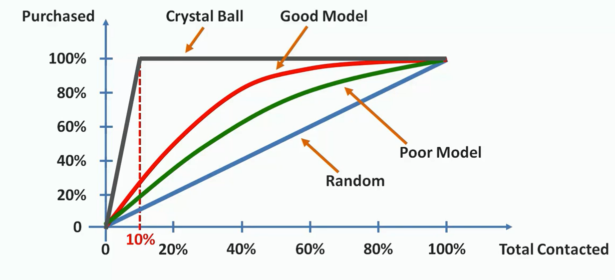
In the above illustration, we have plotted the scenario. First, we draw a random line from the probability we have known earlier( that 10% of our customers will respond). Now, if the area between the model's prediction line and the random line is substantially large, then we can say that this is a good model. If the area is small then the model should be considered as a poor model. Here the red line shows a good model comparable to the green line. The grey line above represents an ideal model. That is when we exactly know the customers who would buy our products.
CAP Curve Analysis
We can easily calculate the goodness of our model from the CAP curve. For this, we first calculate the area between the perfect model line and the random line(aP). We also find the area between the good model line and the random line(aR). Then we take their ratio.
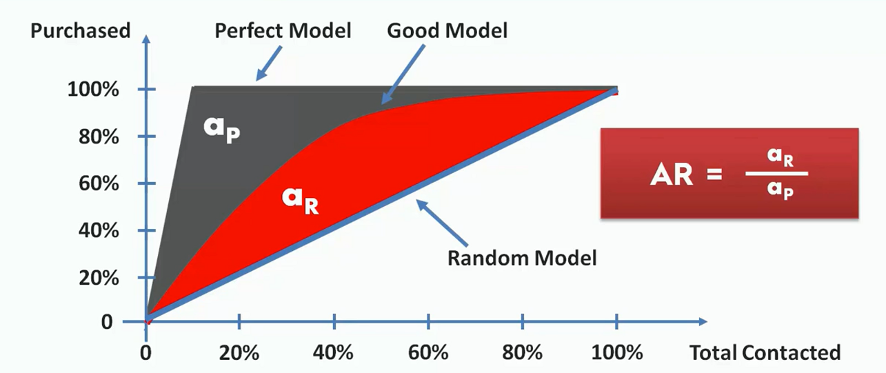
This ratio is between 0 and 1. The more this ratio is closed to one, the better the model is. We can also intuitively decide the goodness of a model just by seeing it. Let's say we take a point on the X-axis(somewhere between 50%). From there we calculate the value on the Y-axis (represented as x).
If the value of x is under 60%, the model is a worse one. If it lies between 60% to 70%, it is a poor model. If the accuracy is between 70% to 80%, it is a good model. Between 80% to 90% will be considered very good. If the model could hit an accuracy between 90% to 100%, you can consider it a too good model.
